Context Installations
This project started with the concept of context. How does context affect are perception of meaning? I chose to use the text messages between me and an individual I had been involved with after the relationship ended in a very complicated, very public manner. The first reason was that he wanted to keep it a secret and was obsessed with secrets in general. This would be the opposite of a secret. I did consider the toll it might take on me being this public with something very private and had my reservations about that aspect. The second reason was this represented something I was still trying to understand and want to just hide from. It felt like by facing it that I could find some resolution.
The text is rich for opportunities to explore context because most of it is highly sexual. Will certain forms make it feel less so? Will others make it seem more? Will it always feel like you are eavesdropping on a private conversation? Does knowing the two of us change how you feel about the text when you view it? Can form affect context? How does pulling a conversation away from the rest change it? Does it change it? These are just some of the things I thought about about as I began the project.
My plan was to explore a wide variety of formats including three dimensional form. I will started with the two treatments—a large scale installation and a more sculptural, three-dimensional form. I had a variety of additional plans to explore this from different avenues but chose not to pursue them after these two. The project felt resolved to some degree as well the personal cost was becoming too much for me.
Vinyl Installation
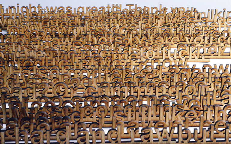
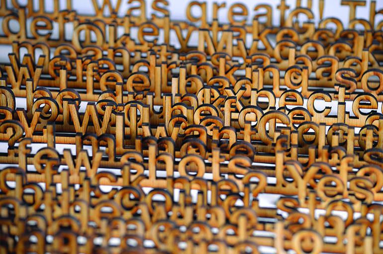
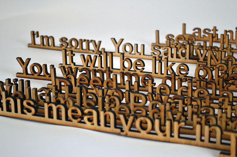
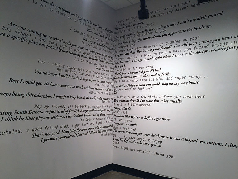
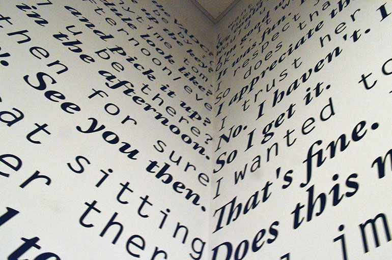
For this context, I made a large scale typographic installation using removeable vinyl. I choose to use black both because it provided a contrast to the white walls but also playing on the idea of seeing something in black and white. I chose a different font for each of our parts in the conversation to provide some contrast and to better convey the idea of a conversation. I chose Garamond Bold Italic for myself because of the weight and the way it flows from one letter to another. I felt it best represented my personality. In contrast, I chose Letter Gothic Slanted for him because it had a more sterile and mechanical quality which best represented how I felt he conducted conversations. He said the exact same things to so many women. I chose italic or oblique versions because I associate that with talking.
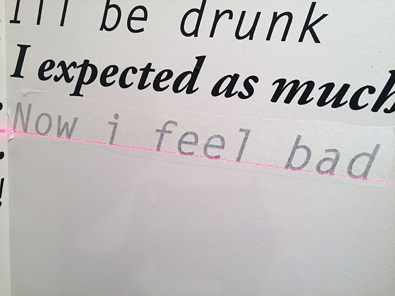
From there I had to determine what text I wanted to use. I settle on choosing several short conversations between him and I early on after we had slept together. The second conversation was the conversation where he told me he had slept with someone else and I still slept with him. It really marked the beginning of the end for our relationship. It also marked the end of my self respect at least in regards to him. I felt the contrast between the two conversations was important in exploring the idea of context. There was such a contrast in context and language. It really emphasizes how bad things got between us. The two conversations meeting at the corner was also important. It involves the possibility of something touching the moment where they was clearly gone. I did not edit the conversations or change misspellings or punctuation issues.
It was overwhelming at points during the process to deal with the text and its emotional impact on me. It definitely succeeded in making me see the words in a different light. It was a slightly surreal experience to run my fingers over the words and look at nine feet of words towering over me. This format definitely makes you feel like you’re eavesdropping on a private conversation. The size of it only adds to how uncomfortable it could make you reading it. It drove home how bad what he said really was but yet I could still laugh about the absurdity of it.
Three Dimensional Forms
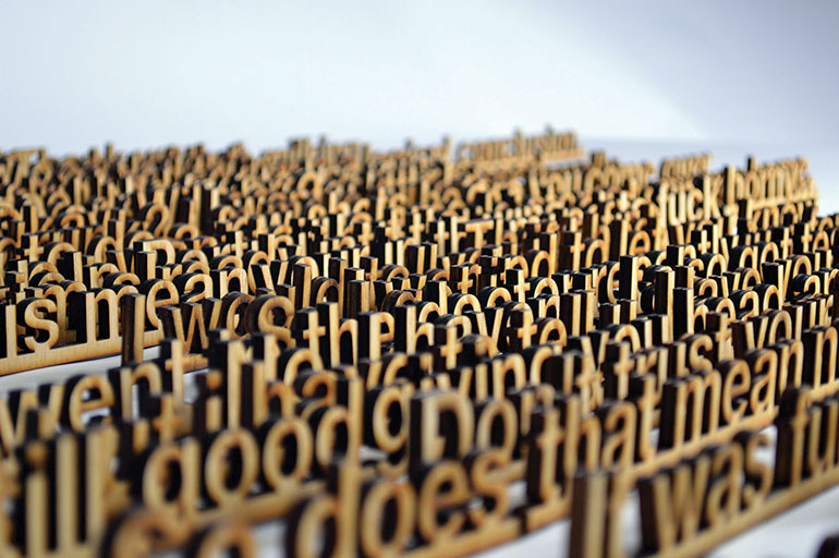
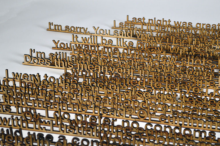
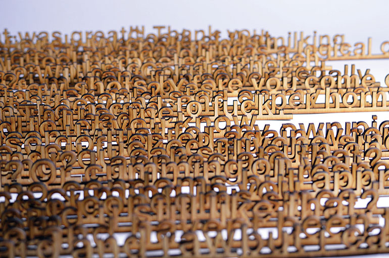
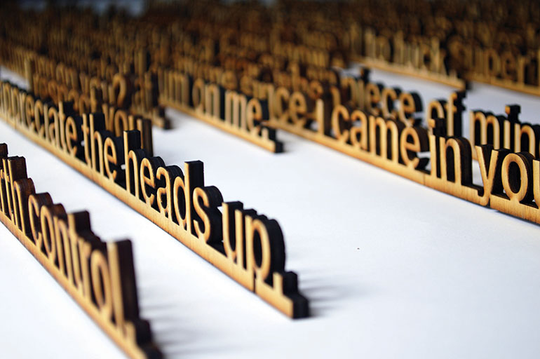
I wondered what a conversation would both look and feel like if it was three dimensional. Would the words have more weight for me personally if they had physical form? How different would the words feel if I could actually touch them? Walk around them? Would it look any different beside the typeface? It put the conversation in a completely different context than just words on the screen or on
the wall.
I took the second conversation from the first part of this project and cut it out of pine plywood. I picked the second part because it was the far more explicit and challenging text for me on an emotional level. I needed to consider how that much type could be accessed in three dimensional form. If I just cut out the letters than I would have a pile of letters to do something with but no good idea what they might be. After doing some research, I decided to put a simple bar along the bottom of the type so it could stand up. This meant I need to choose a font with descenders that did not extend that far past the baseline of the font. I settled on Helvetica because I kept thinking of the ubiquitous quality of it and it met the technical specifications I needed. I set the entire conversation in the same font this time with the thought that I could always stain the two differently in the future if I wanted the distinction between who said what. In the end, I liked that you can’t easily distinguish between the two.
My overall impression of this version of the words gave them physical weight and made it far more real to me what was said. It was difficult to touch them and hold them in my hands. I remarked to myself how I would like to light some of them on fire. Perhaps that’s something to explore at a later date. I’m still having trouble resolving the idea that allowed someone to talk to me in this way and the ridiculousness of him saying he respected me when clearly he didn’t. The physicality of the words produced very different emotions than the flat installation.