Grid and Typographic Structure
The goal of this project is to explore the connection between content and form while using a grid and hierarchy. How does how words are placed on the page influence their meaning and interpretation? How does the layout influence the reader's ability to access the information? Do your layout decisions influence the perception of the content? Can the type completely becoming image independent from the content?
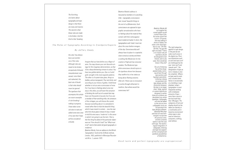
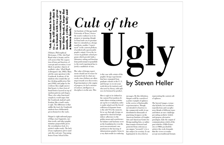
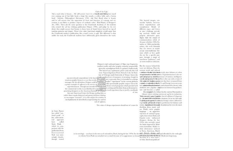
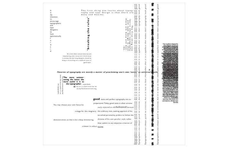
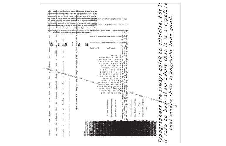
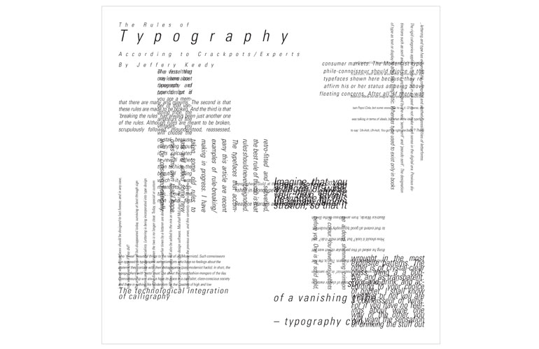
You will choose one of two articles on typography to use for the assignment. Both articles are from the early 90s when grunge typography and Postmodernism with their deconstruction of the page were at the height of popularity challenging Modernism's clean, rational design. The first, Steven Heller's "Cult of the Ugly", he takes on the word ugly as he sees it applied to graphic design and design education. En route, his views of art history, pop culture and recent design trends are considered in his essay about style and meaning in design. The second, Jeffery Keedy's The Rules of Typography According to Crackpots/Experts", challenges received wisdom and offers some ‘rules’ of his own. Keedy was the director of graphic design at California Institute of the Arts at the time of the article's publication. Both authors are looking critically at what defines "good" typography. The text of the article you choose will become the content for your project.
This project will continue the exploration of grid started in exercise 3. As you learned, a grid can consist of a single column framed by margins, or it may have multiple columns. When you design a grid, you typically begin with vertical divisions (columns), and then add horizontal divisions. You use guidelines to divide the grid again horizontally. Arrange your bodies of text using variations when assigned on the grid. It is essential to visualize your design prior to working in InDesign by creating thumbnail sketches to explore possible layout options.
Layout 01 - Using one typeface, 9 pt. size only throughout the layouts type along the X-Axis only
Layout 02 - Using one typeface introduce 4-5 other point sizes type along the X-Axis and Y-Axis. Reference Golden Ration/Rectangle.
Layout 03 - Use variations in point size and style within ONE type family type along the X-Axis, Y-Axis and Z-Axis
Layout 04 - Use any typeface/s and use variations in point size and style within any type family/families set type along the X-Axis, Y-Axis and Z-Axis