Typography
This three-credit hour studio course will introduce students to the practice, history, and theory of typography. Through design research, independent project work, and collaborative exercises, students will produce typographic solutions to applied and experimental problems using typography as their primary, if not exclusive, design element. Course work will include independent student research, sustained project work, and critiques, emphasizing the perceptual and contextual properties of typographic design. Lectures, readings, and guided discussions will supplement project work, introducing students to the topics of letter form design, printing history, typographic classification, and textual representations.
- Download the Syllabus
- Exercise 1: Build a Type Specimum Library
First and foremost, designers are keen observers and lovers of useful and beautiful objects, communications, messages, and experiences. They pay attention as they move through their day, possessing a hyper-awareness of the visual and textual world around them. They make connections and ask questions about how those objects and messages work, what they are, what things look like, how they were made, and what they mean. In order to begin developing these essential skills, we will go on a group field trip around campus and the surrounding area to observe the designed world and hunt for visual communications in typographic form. - Exercise 2: Drawing Type/Type Drawing
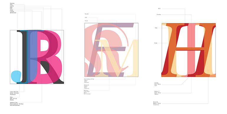
All letterforms are constructed of parts that make up their form. These parts are called anatomy. This exercise will help familiarize you with the various type anatomy terms and how to identify them on letterforms. Stack three letterforms in various hues and shades. Diagram the properties of each typeface. Label the typefaces and as many parts of the letters and as you can. - Exercise 3: Visual Organization & Grid Structures
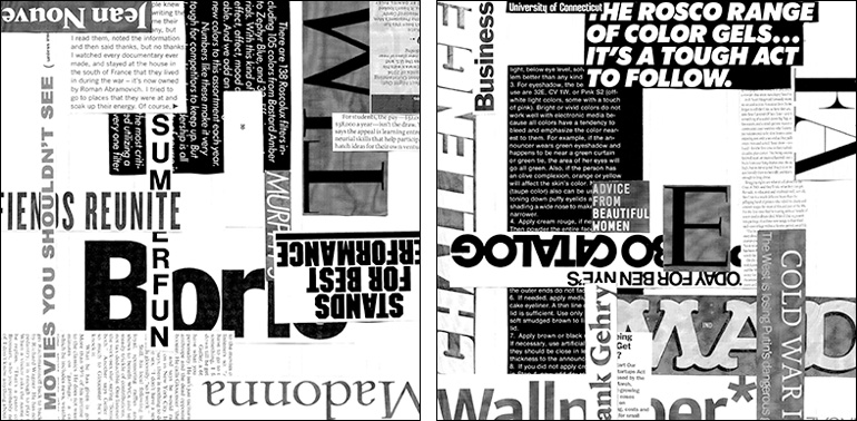
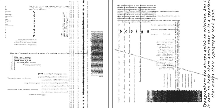
In this Exercise you will begin to explore the grid as an underlying structure and the concept of visual hierarchy. As designers, we usually have to accept the nature of the typeface as it is designed. It becomes our responsibility to use typefaces in ways that make them easy to read. It is possible to use a very legible typeface in a manner that renders it virtually unreadable [by setting the kerning too tightly or by using the leading too generously]. On the other hand, a designer may choose a typeface that has poor legibility, and make readable by adjusting the kerning and leading.
Working with text type, we cannot avoid the issues of legibility and readability. Legibility is determined by the shape or structure of each letterform and whether it is distinguishable enough to recognize easily. Legibility is the responsibility of the typeface designer, however, we are not so concerned with whether or not there is a clear textual message in the compositions. This exercise will allow you to create compositions with type as form that are visually engaging without worrying about the meaning of the words. - Project 1: Grid and Typographic Structure
The goal of this project is to explore the connection between content and form while using a grid and hierarchy. How does how words are placed on the page influence their meaning and interpretation? How does the layout influence the reader's ability to access the information? Do your layout decisions influence the perception of the content? Can the type completely becoming image independent from the content?
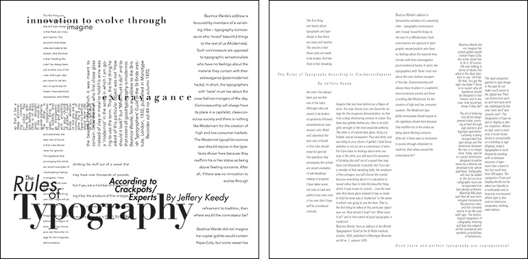
You will choose one of two articles on typography to use for the assignment. Both articles are from the early 90s when grunge typography and Postmodernism with their deconstruction of the page were at the height of popularity challenging Modernism's clean, rational design. The first, Steven Heller's "Cult of the Ugly", he takes on the word ugly as he sees it applied to graphic design and design education. En route, his views of art history, pop culture and recent design trends are considered in his essay about style and meaning in design. The second, Jeffery Keedy's The Rules of Typography According to Crackpots/Experts", challenges received wisdom and offers some ‘rules’ of his own. Keedy was the director of graphic design at California Institute of the Arts at the time of the article's publication. Both authors are looking critically at what defines "good" typography. The text of the article you choose will become the content for your project.
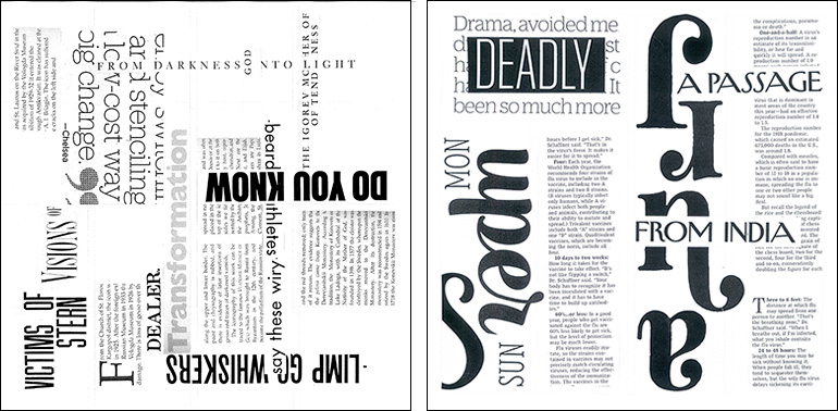
This project will continue the exploration of grid started in exercise 3. As you learned, a grid can consist of a single column framed by margins, or it may have multiple columns. When you design a grid, you typically begin with vertical divisions (columns), and then add horizontal divisions. You use guidelines to divide the grid again horizontally. Arrange your bodies of text using variations when assigned on the grid. It is essential to visualize your design prior to working in InDesign by creating thumbnail sketches to explore possible layout options. - Project 2: Typographic History Timeline
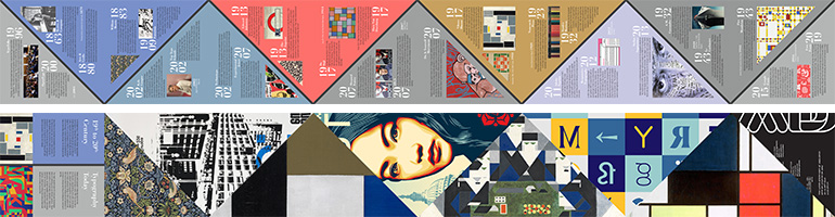
You will be responsible for researching two assigned periods of time in the history of typography. Each student will have one older and one newer time period to research. The timeline in Chapter One of the Typography Design: Form and Communication will serve as an excellent resource and guide to your to initiate your research.
You will need to locate at least 6 sources for your research for your annotated project bibliographies are required. Not all research will take place on the internet. You may only use the internet to locate resources in print format and obtain a general idea of the topic to investigate. Find books and print materials to use. The provided course reading list can help with this. Get creative with your resources. Go beyond the Google search. It should also be noted your graphic design history book will only take you so far.
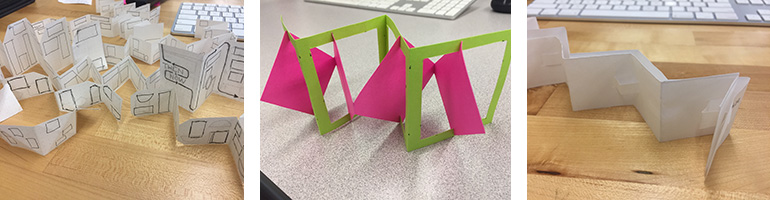
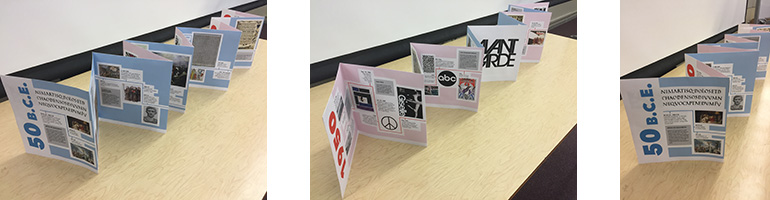
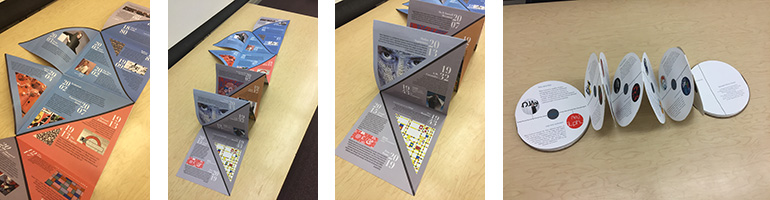
Using the research into these time periods, you will design an accordion fold timeline that showcases your knowledge of typography and the history of the development of the western alphabet. The timeline will contain information about an assigned research topics and will require you to find a way to marry together two very different periods of typographic history. The timelines will serve as infographics and will demonstrate an understanding of the ways in which typography, as a discipline, has been influenced by the economic, social and/or political conditions of a place and time.You will explore typographic systems to represent the different levels of information the timeline communicates about. The timeline will introduce you to principles of effective page layout, the grid, hierarchy and control of white space. It will also introduce you to how to create a typographic system and further your understanding of typographic hierarchy. You will also want to explore the form the book will take. You may choose square, rectangular or some other shape for your panels. You may chose to do more a more complicated accordion fold than a straight fold. You final decisions on form should align with the content. - Project 3: Type in Motion
For this project, you will be creating a one minute kinetic typography video. You will choose a segment of a television show, movie, or speech to animate. You will need to use the sound of the chosen segment with you animated typography. You will need to time your animation to work with the sound. The arrangement or animation will reveal the meaning of the audio quote and will tell a short story about its intended meaning. You should use text only. Look at the provided examples below and how they connect meaning with the type setting and animation.
When working with animation, storyboardingPreview the document is an important step to the success of the project. Like thumbnail sketches, storyboards are quick sketches but they also introduce the idea of mapping out the animation. You use the frames to explore how the items on screen will move and interact. You make notes as to what will move where. Any animated movie or video you have watched most likely used storyboarding to realize the final product. Pixar even includes storyboarding sessions for their projects as extras on some of their dvds. Storyboarding will be essential to assisting you in realizing your ideas.
Before beginning on the final project, you will do two short studies using type animation to help introduce you to the software and animation principles. The two studies will be submitted for review and critique.